A gentle introduction to SHAP values in R
Hi there! During the first meetup of argentinaR.org -an R user group- Daniel Quelali introduced us to a new model validation technique called SHAP values.
This novel approach allows us to dig a little bit more in the complexity of the predictive model results, while it allows us to explore the relationships between variables for predicted case.

I've been using this it with "real" data, cross-validating the results, and let me tell you it works.
This post is a gentle introduction to it, hope you enjoy it!
Find me on Twitter and Linkedin.
Clone this github repository to reproduce the plots.
Introduction
Complex predictive models are not easy to interpret. By complex I mean: random forest, xgboost, deep learning, etc.
In other words, given a certain prediction, like having a likelihood of buying= 90%, what was the influence of each input variable in order to get that score?
A recent technique to interpret black-box models has stood out among others: SHAP (SHapley Additive exPlanations) developed by Scott M. Lundberg.
Imagine a sales score model. A customer living in zip code "A1" with "10 purchases" arrives and its score is 95%, while other from zip code "A2" and "7 purchases" has a score of 60%.
Each variable had its contribution to the final score. Maybe a slight change in the number of purchases changes the score a lot, while changing the zip code only contributes a tiny amount on that specific customer.
SHAP measures the impact of variables taking into account the interaction with other variables.
Shapley values calculate the importance of a feature by comparing what a model predicts with and without the feature. However, since the order in which a model sees features can affect its predictions, this is done in every possible order, so that the features are fairly compared.
SHAP values in data
If the original data has 200 rows and 10 variables, the shap value table will have the same dimension (200 x 10).
The original values from the input data are replaced by its SHAP values. However it is not the same replacement for all the columns. Maybe a value of 10 purchases is replaced by the value 0.3 in customer 1, but in customer 2 it is replaced by 0.6. This change is due to how the variable for that customer interacts with other variables. Variables work in groups and describe a whole.
Shap values can be obtained by doing:
shap_values=predict(xgboost_model, input_data, predcontrib = TRUE, approxcontrib = F)
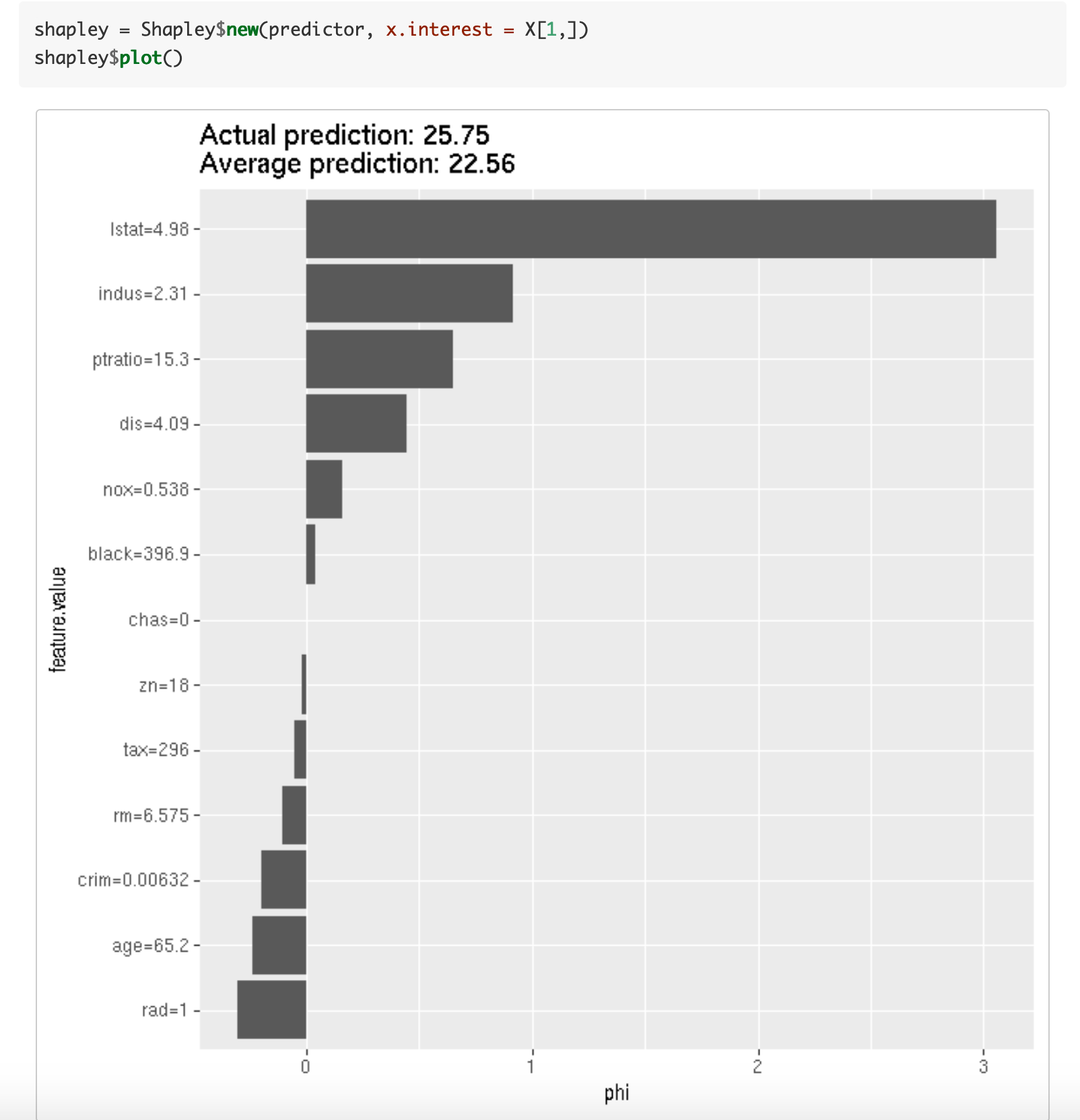
Example in R
After creating an xgboost model, we can plot the shap summary for a rental bike dataset. The target variable is the count of rents for that particular day.
Function plot.shap.summary (from the github repo) gives us:
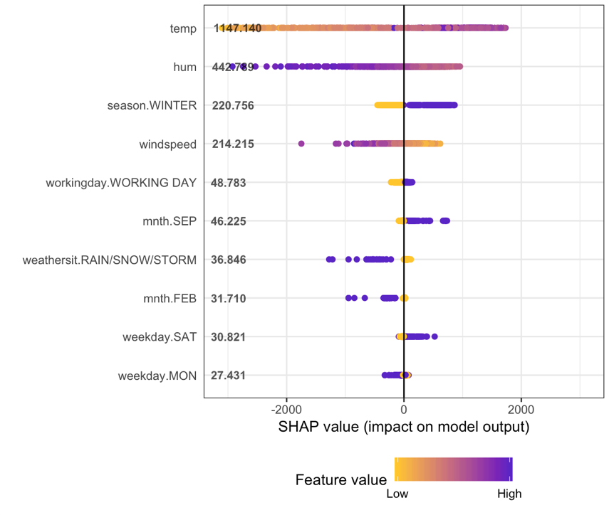
How to interpret the shap summary plot?
- The y-axis indicates the variable name, in order of importance from top to bottom. The value next to them is the mean SHAP value.
- On the x-axis is the SHAP value. Indicates how much is the change in log-odds. From this number we can extract the probability of success.
- Gradient color indicates the original value for that variable. In booleans, it will take two colors, but in number it can contain the whole spectrum.
- Each point represents a row from the original dataset.
Going back to the bike dataset, most of the variables are boolean.
We can see that having a high humidity is associated with high and negative values on the target. Where high comes from the color and negative from the x value.
In other words, people rent fewer bikes if humidity is high.
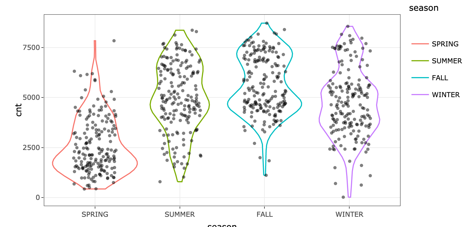
When season.WINTER is high (or true) then shap value is high. People rent more bikes in winter, this is nice since it sounds counter-intuitive. Note the point dispersion in season.WINTER is less than in hum.
Doing a simple violin plot for variable season confirms the pattern:
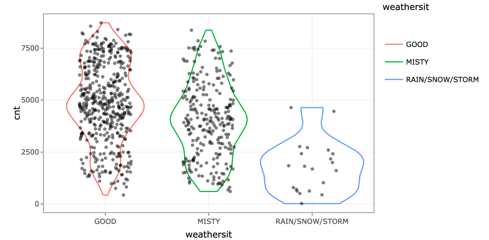
As expected, rainy, snowy or stormy days are associated with less renting. However, if the value is 0, it doesn't affect much the bike renting. Look at the yellow points around the 0 value. We can check the original variable and see the difference:
What conclusion can you draw by looking at variables weekday.SAT and weekday.MON?
Shap summary from xgboost package
Function xgb.plot.shap from xgboost package provides these plots:
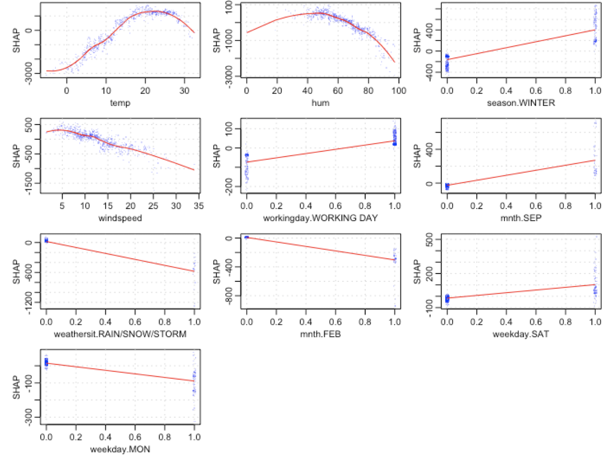
- y-axis: shap value.
- x-axis: original variable value.
Each blue dot is a row (a day in this case).
Looking at temp variable, we can see how lower temperatures are associated with a big decrease in shap values. Interesting to note that around the value 22-23 the curve starts to decrease again. A perfect non-linear relationship.
Taking mnth.SEP we can observe that dispersion around 0 is almost 0, while on the other hand, the value 1 is associated mainly with a shap increase around 200, but it also has certain days where it can push the shap value to more than 400.
mnth.SEP is a good case of interaction with other variables, since in presence of the same value (1), the shap value can differ a lot. What are the effects with other variables that explain this variance in the output? A topic for another post.
R packages with SHAP
Interpretable Machine Learning by Christoph Molnar.
A Python wrapper:
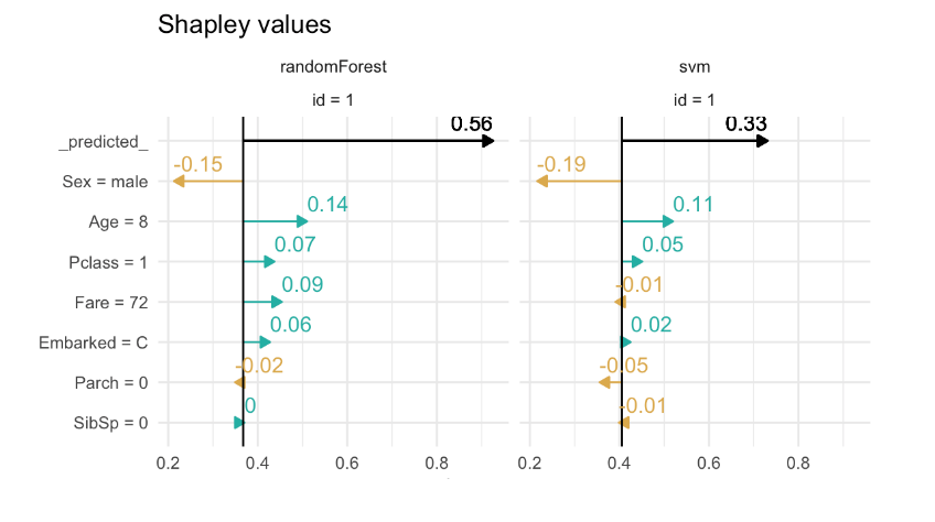
Altough it's not SHAP, the idea is really similar. It calculates the contribution for each value in every case, by accessing at the trees structure used in model.
Recommended literature about SHAP values 📚
There is a vast literature around this technique, check the online book Interpretable Machine Learning by Christoph Molnar. It addresses in a nicely way Model-Agnostic Methods and one of its particular cases Shapley values. An outstanding work.
From classical variable, ranking approaches like weight and gain, to shap values: Interpretable Machine Learning with XGBoost by Scott Lundberg.
A permutation perspective with examples: One Feature Attribution Method to (Supposedly) Rule Them All: Shapley Values.
--
If you have any questions, leave it below :)
Thanks for reading! 🚀
Other readings you might like: